
Dashboard at a glance
The dashboard is the home base of Scout. This page gives you a guided tour, top to bottom, so you know what every chart means and where to click next.
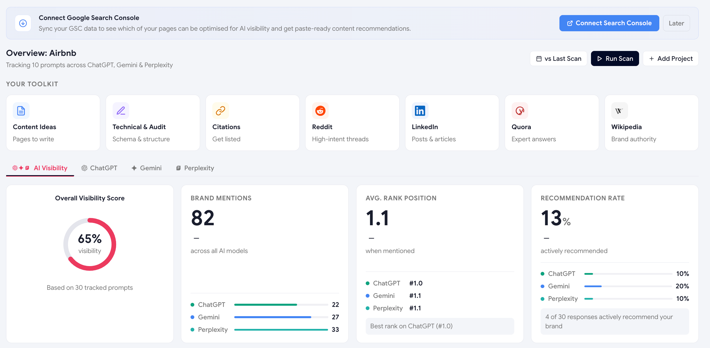
1. Demand Reach hero strip (top)
The first thing you see is the Demand Reach strip — the total monthly Google search demand reachable across every prompt you're tracking. It's the business-level metric that frames everything below: "Your tracked prompts touch a market of X searches per month."
Mention counts are vanity metrics. Demand Reach is the actual market opportunity your AI visibility work is going after — sized by real Google search data. Use this in stand-ups instead of "we got 12 mentions this week."
2. The gauge row
Three large visual summaries sit just below the hero strip. They give you the "is everything OK?" answer in one glance, before you dive into details.
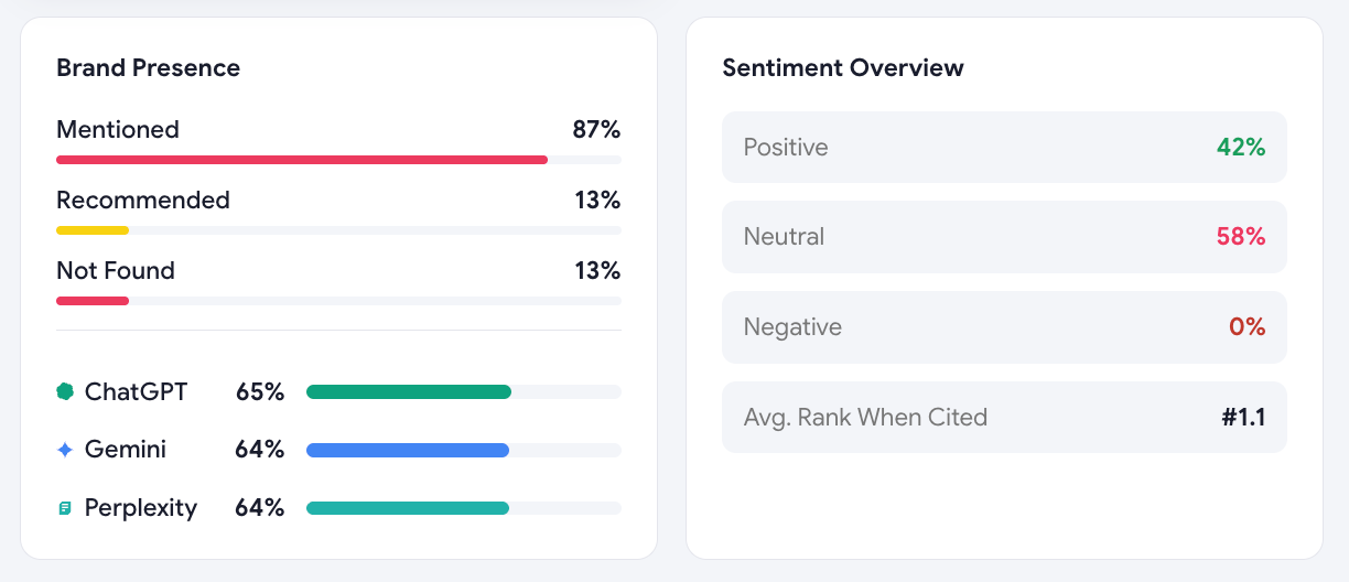
- Overall Visibility ScoreA 0–100 gauge with a trend arrow vs the previous scan. The single number you'll quote in stand-ups.
- Brand Presence BreakdownA donut splitting prompts into Mentioned · Recommended · Absent.
- Sentiment OverviewA second donut splitting mentions into Positive · Neutral · Negative.
3. The model tabs
Just under the gauges, four tabs let you slice the data by AI engine:
- AI Visibility (default — combined view)
- ChatGPT
- Gemini
- Perplexity
Clicking a model tab updates the top row (gauge, presence breakdown, sentiment) for that engine — but the KPI cards underneath always stay on the overall data. That's deliberate: you switch tabs to compare models, not to lose your big-picture stats.
4. The KPI cards
Three cards summarising the key counts, with per-model breakdowns inside:
| Card | What it shows |
|---|---|
| Brand Mentions | How many AI responses contained your brand name, broken down by ChatGPT / Gemini / Perplexity. |
| Avg. Rank Position | When mentioned, where in the answer you typically appear (1 = first). |
| Recommendation Rate | % of mentions that were active recommendations (not just listings). |
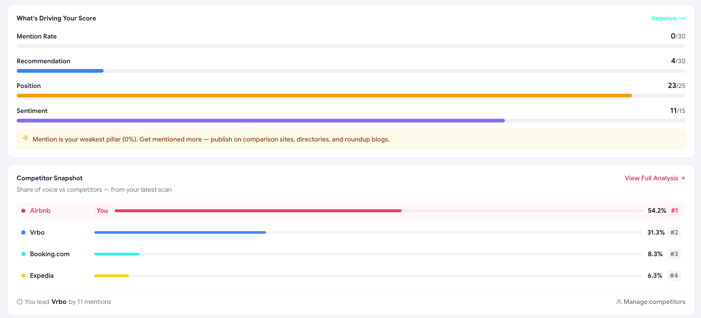
5. Score Movement
The Score Movement panel shows the prompts that moved your visibility score the most since the previous scan — drops on top, gains below. Click any row to jump straight to the AI Responses page filtered to that prompt.
6. Recent AI responses
A scrollable table showing the most recent answers Scout collected. Each row shows:
- Which AI engine answered
- The original prompt
- An excerpt of the response (with your brand and competitors highlighted)
- Mention/recommendation/sentiment chips
Click any row to see the full answer, the structured analysis, and the cited sources.
Full guide to the AI Responses page →7. The welcome popup (first scan only)
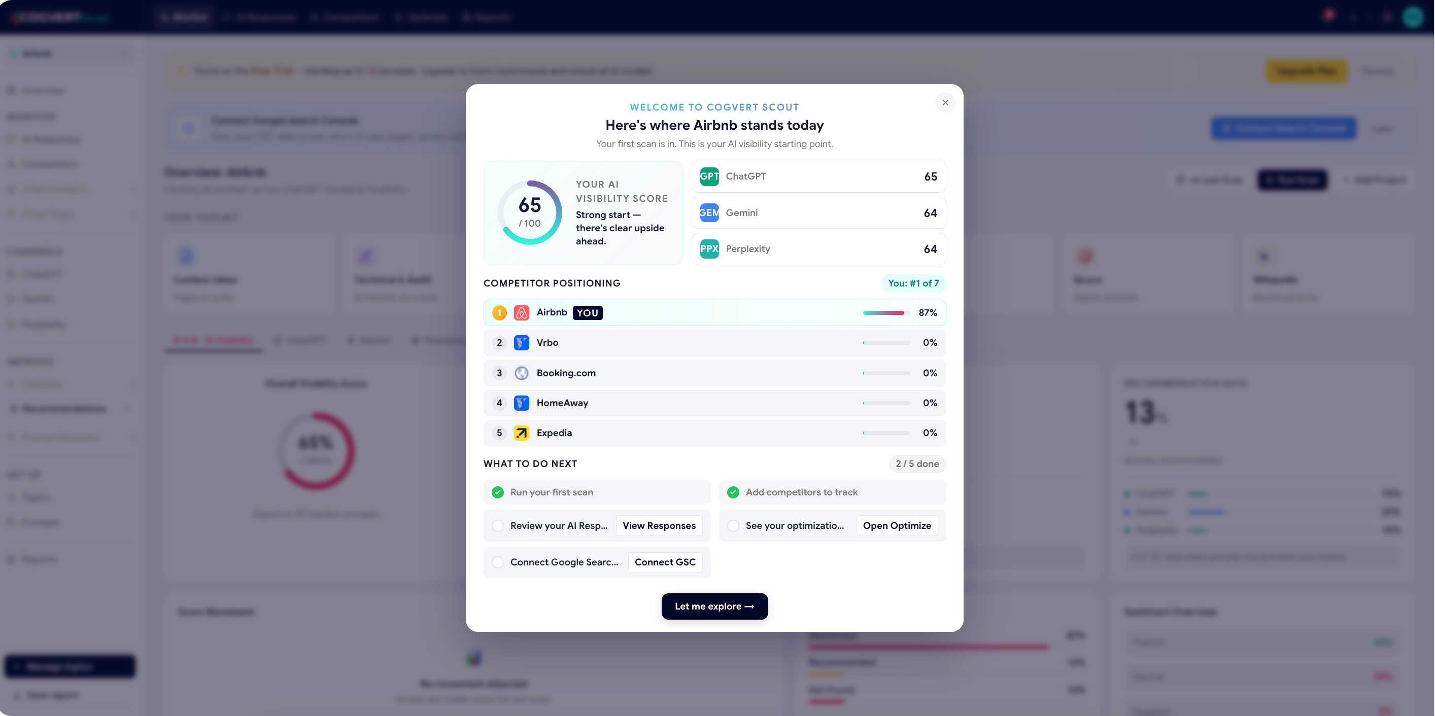
The very first time you land on the dashboard after onboarding, a welcome popup walks you through your initial visibility score, your competitor positioning and a checklist of "what to do next." You can dismiss it once you've reviewed it — it won't appear again.
8. The left sidebar — your map
The dashboard sidebar groups every page into three buckets that mirror the user journey:
- Monitor — Overview, AI Responses, Competitors, Cited Pages, Cited Domains
- Improve — Optimize, Recommendations, Prompt Discovery
- Set up — Topics, Prompts, Reports
The reading order we recommend
For your first 10 minutes inside Scout, read the dashboard in this order:
Note your Demand Reach
How much market opportunity are you tracking?
Glance at the gauge row
Are we above or below 50? Trend up or down?
Switch through the model tabs
Which engine is our weak spot?
Check Score Movement
What changed since last scan — and why?
Open Recent AI Responses
Read 5 actual answers — feel the texture of the data.
Open Optimize Hub
Pick one quick win and ship it this week.
Was this page helpful?
Thanks for the feedback — we read every response.